I started the foosball table by creating a chamfer box. I then added a FFD 3x3x3 modifier and dragged the bottom corners in towards the centre.
I then created another chamfer box inside the top of the table and cut it out of the table using the Boolean tool.
The screenshot below shows how I cut the shape of the lego-man head out of the table. I created two chamfer boxes to create the shape of the head and again cut it out using the Boolean tool.
The screenshot below shows the outcome of this Boolean extraction.
Next I converted it to an editable polygon and made the edges at the top of the table curved making the table look a bit smoother and gives it a better finish.
I also put in the goals and the hole behind the goal to lift the ball out. To make the goals I created a chamfer box and using a FFD 3x3x3 modifier I altered the corners so that it fit inside the slants of the table.
This is all shown in the screenshot below.
The next thing I had to do was make the holes for the players poles to go through. To do this I drew a circle and using the array tool added another 7 and moved them into position before extruding.
After extruding them, above, I used the Boolean tool to cut them out of the table.
The next thing I had to do was make the handles that controls the players on the poles. They are a simple cylindrical shape with a lego-man-head at the end of it.
I then made several clones of this handle and placed them beside the holes in the table.

I then made the poles that run from the handles through the players on the pitch, which are shown in the shots below.
In the real world the poles in the screenshot below would slide out and move about too much so I made black plugs for the holes making the grip on the pole tighter but still leaving enough room for the poles to spin. This can be seen in later screenshots.
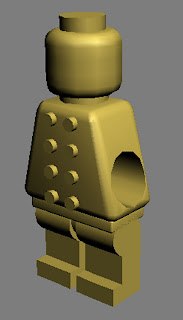
Next I thought about making the players which are of course lego men. I started off with the head just by using chamfer boxes.
I made the legs of the players by drawing a series of lines in the basic shape of the leg and converted the corners in the circular bit at the top to beziers. The screenshot below shows it in working progress.
After completing the lego man I placed it on the foosball table on the pole and performed a Boolean extraction to make the hole on the side of the player.
In my design all the players on the table look like the screenshot below, the kits come separately so you can buy the kit of your favourite team, which fits onto the players like a lego bloc.
To make the full team I made clones of the lego man and dragged them to the different positions on the pitch.
I then rotated a player to make it face the other way and made clones of it to make the opposing team. Both teams players are yellow but one team is shown in red in this screenshot so you can tell the difference.
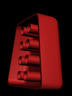
The kits will look like this, as you can see they contain sockets on the back to fit onto the players. On the front they will resemble the real kits.
This is the final look of the tables with the home team in red and the away team in blue. I still have to work on the materials, such as the kits, the pitch, and the material of the table itself.
I made the Liverpool amd Chelsea kits in Photoshop and saved them as Jpegs.
I then put them on the players as a material. I also added faces to the players by selecting the polygons at the front of the head and clicking add to selection after making the face in photoshop.
I also put the pitch on the table by selecting the polygons on the inside of the table and clicking add to selection, again after making the pitch in photoshop.


